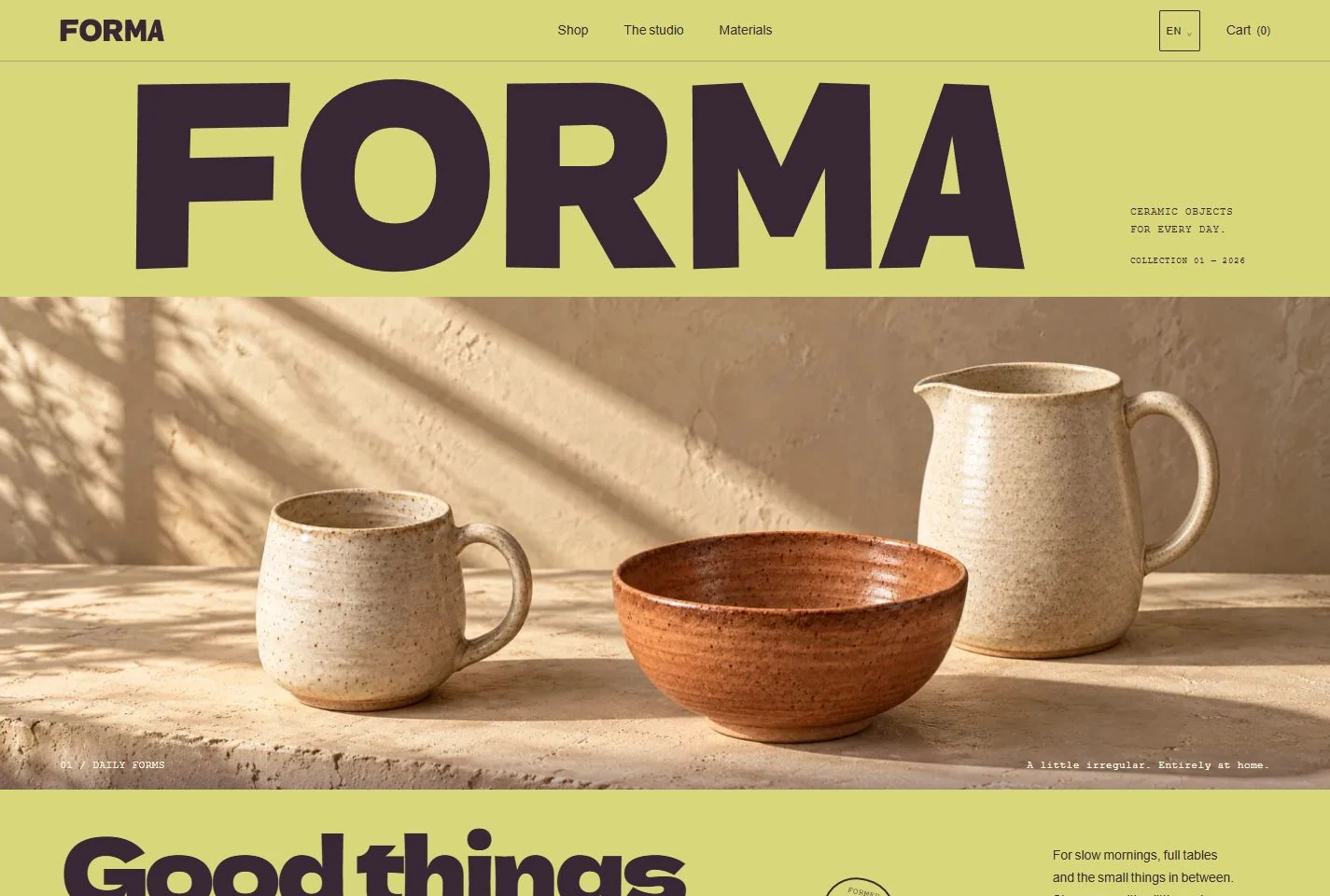
The starting point
Give a small ceramics collection a memorable identity and make the feel of handmade objects tangible on screen. Help visitors move naturally from an appealing shape to the right glaze, practical details and a clear basket.
The design response
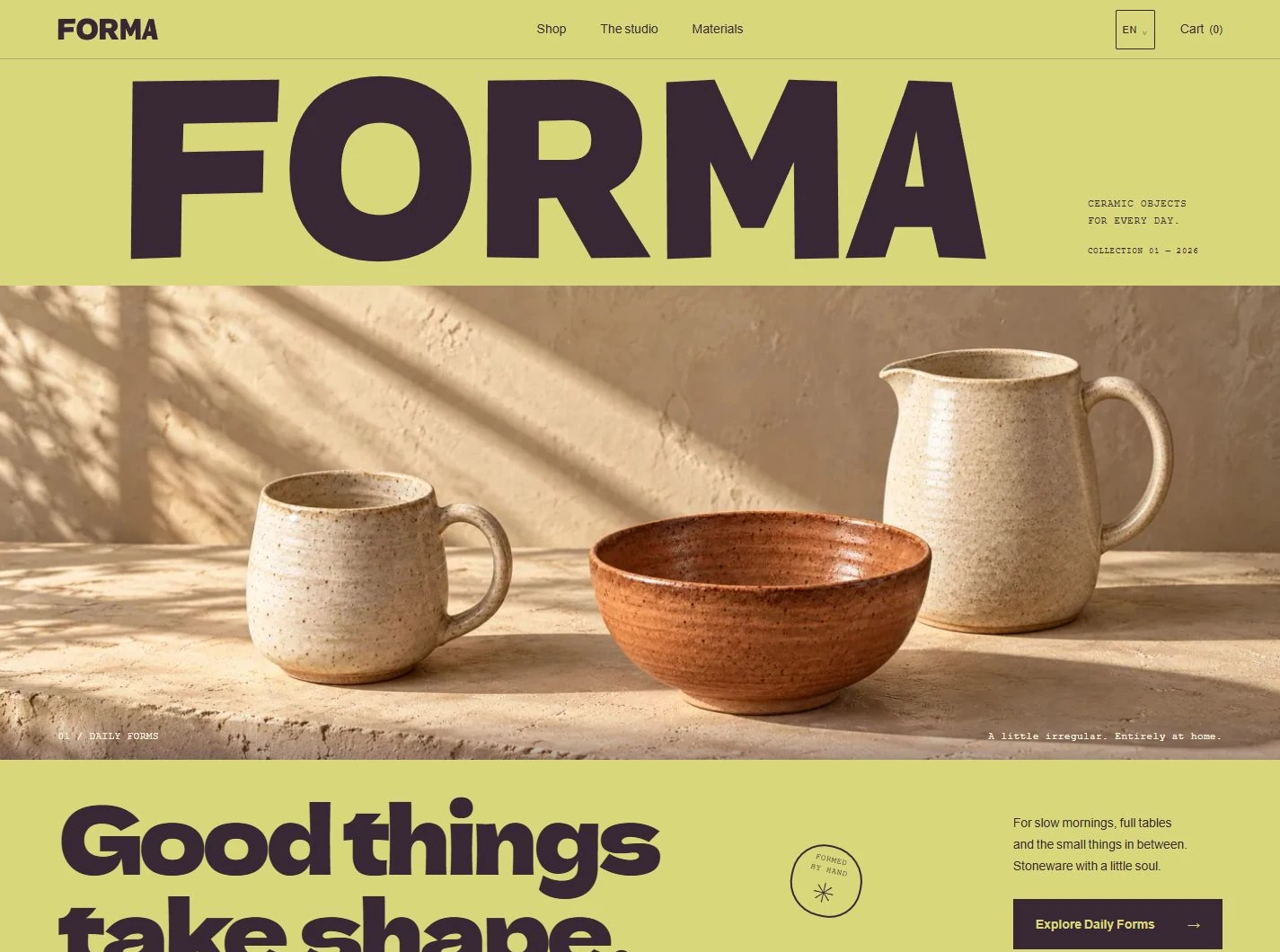
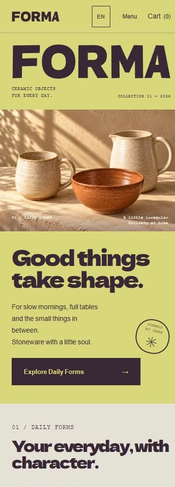
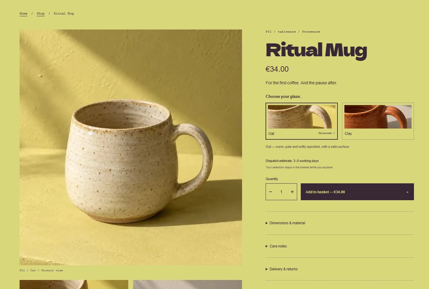
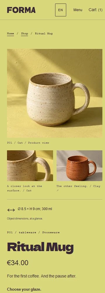
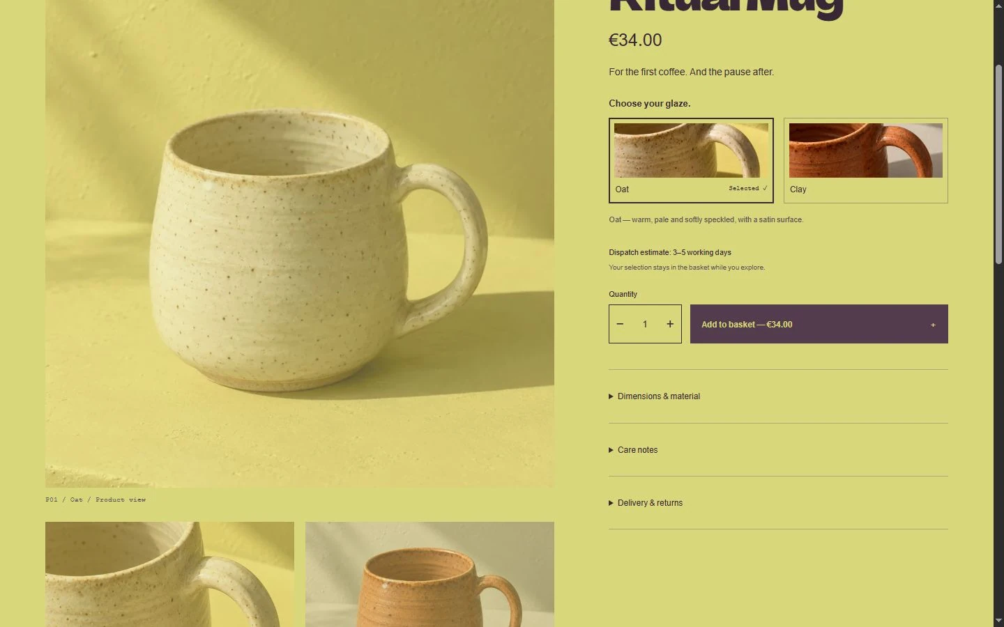
A deliberately irregular wordmark, bold soft lettering and sunlit surfaces build a confident craft identity. The photography brings throwing rings, speckled glaze and biscuit feet close. Oat and Clay change the actual product views, while labelled texture tiles, large details and dimensions make comparison easy. The same character carries through the catalogue, studio, basket and mobile layouts.
Explore the experience
Explore the store in EN, DE or RU. Search the collection, compare Oat and Clay, enlarge a photograph and choose a quantity. The basket keeps different finishes separate and updates item totals and delivery as the selection changes. Continue to a clear final order review.
Explore the website ↗An independent project by Bureau Fast.
Another way to see the approachLINEA ↗